
Creating a digital experience for students and members to enhance their French language and culture journey
-

Company
L’Alliance Française Houston
-

My Role
Freelance UX Designer
-

Project Type
End-to-End Mobile REsponsive Website
-

Team
Moi
-

Tools
Figma, ChatGPT
-

Year
2023
Project Overview
L'Alliance Française Houston promotes the French language and Francophone cultures.
While taking classes there, I saw an opportunity to improve their website.
I transformed the website into a digital student and member experience aimed at increasing the number of students enrolled in French classes, paid members and sponsors of the Alliance, and event attendees.

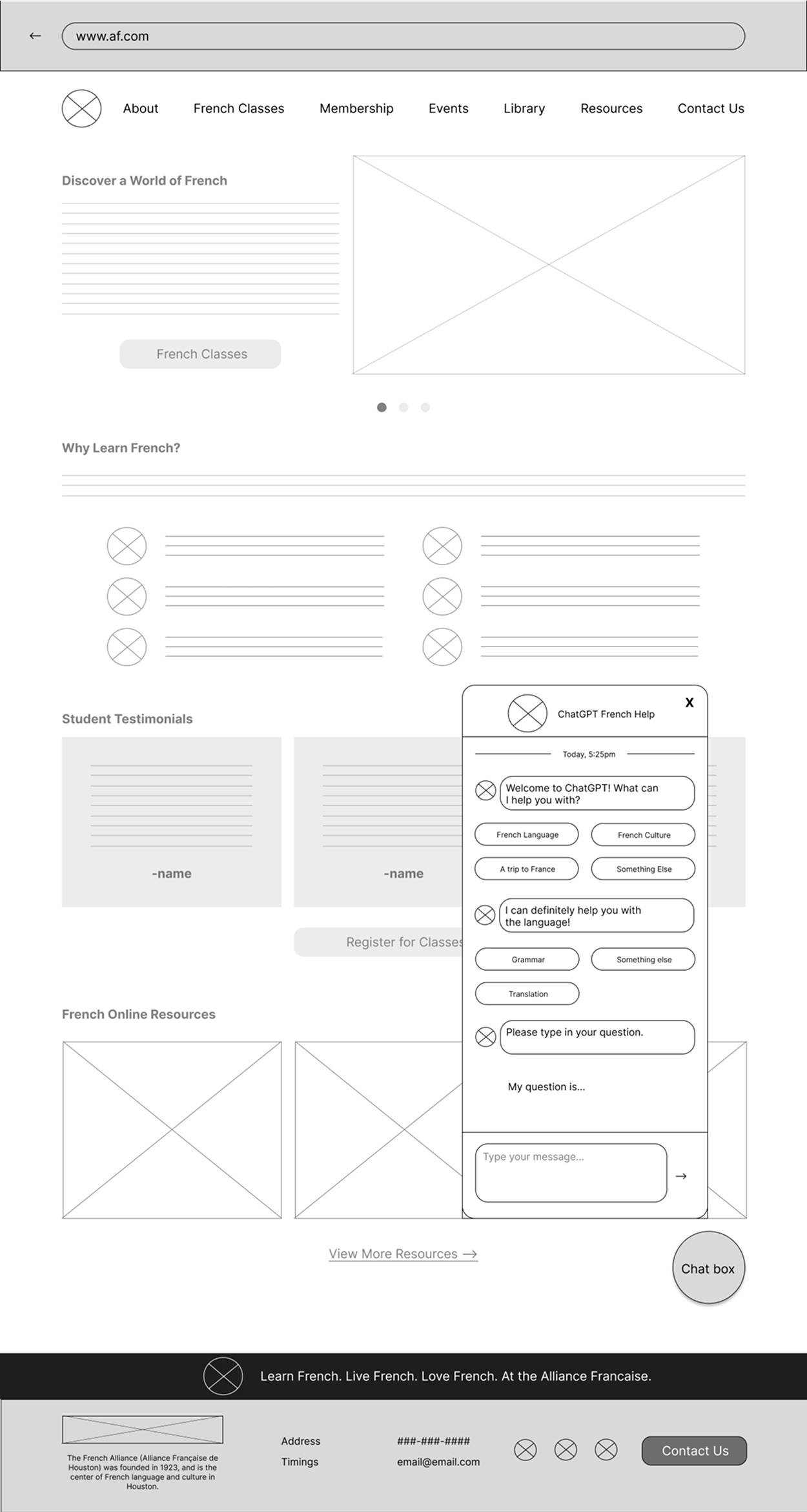
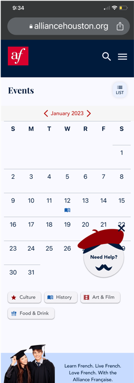
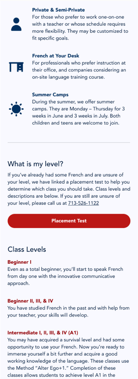
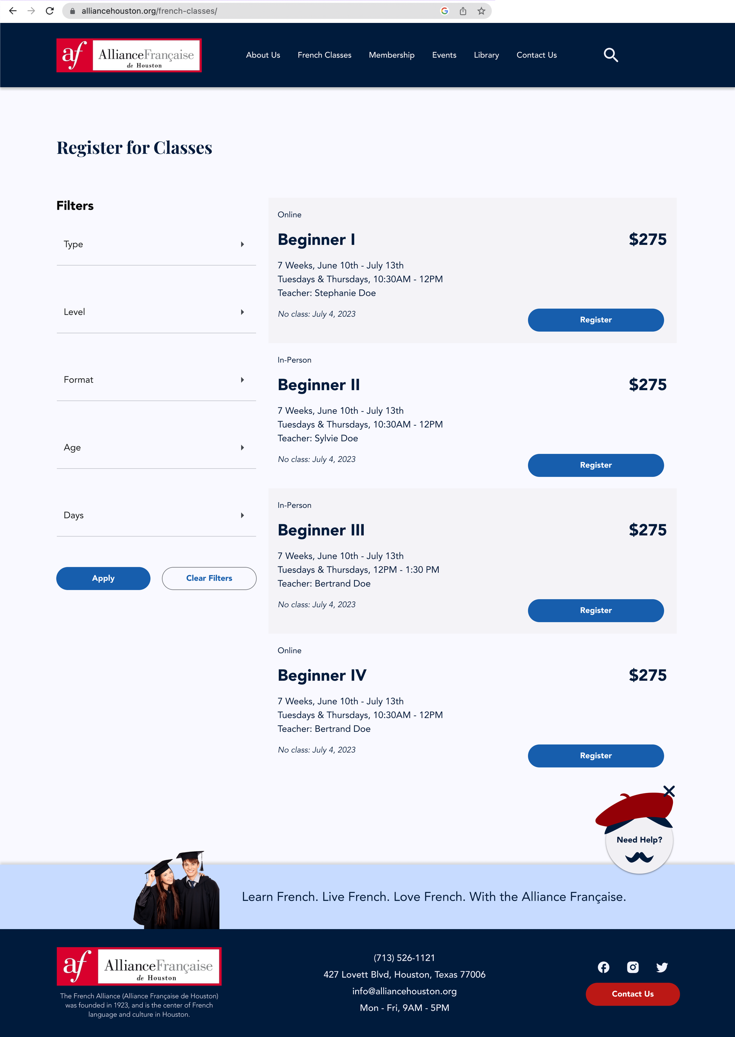
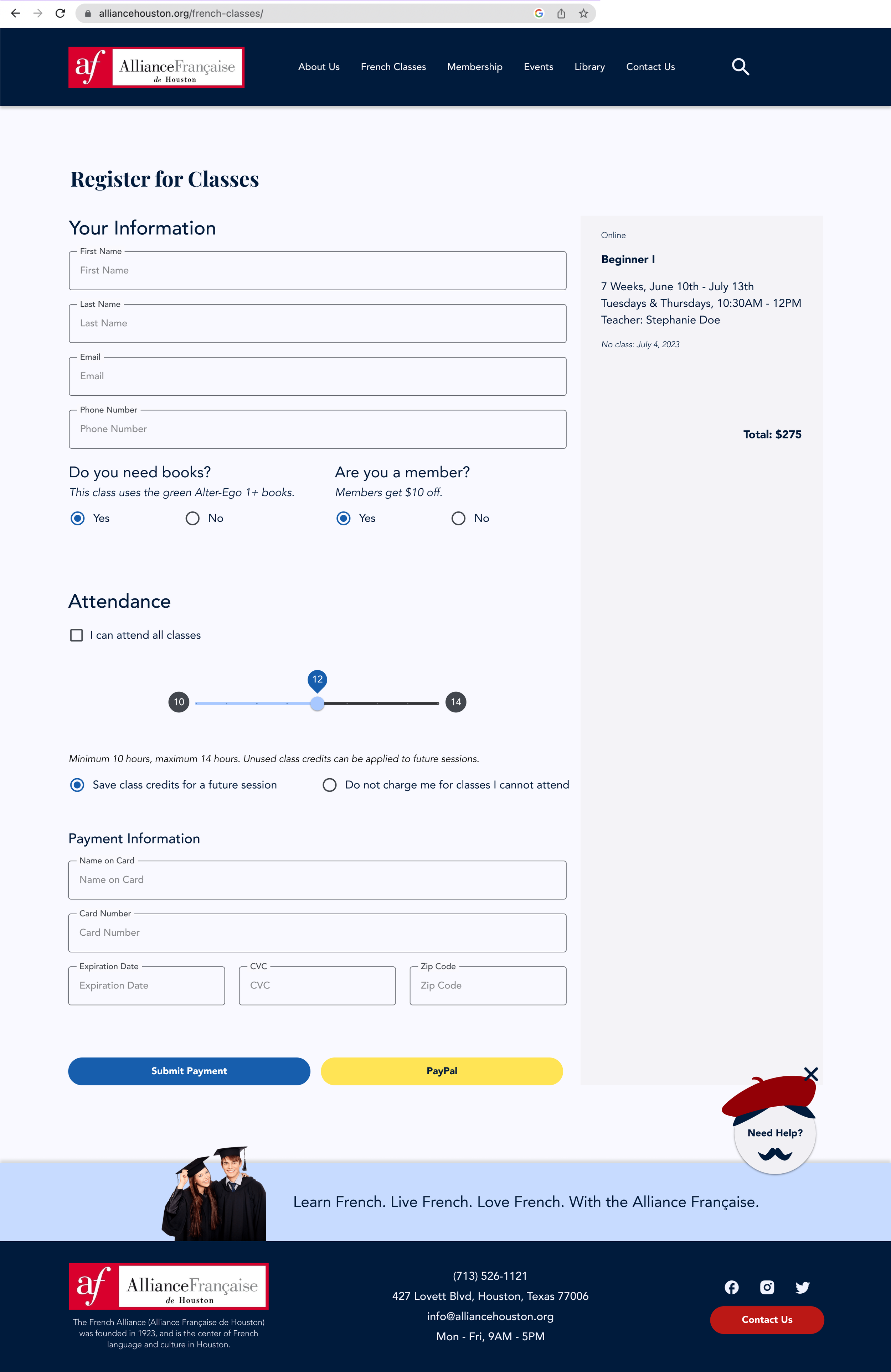
The new UI of the website experience.
Problem
The website was minimal, outdated, and unusable on mobile. The Alliance promoted events on paper and through email.
Even though students had only positive things to say about the organization and the in-person interaction, they had nothing positive to say about the website and online experience and felt it was detrimental to their experience as students.

The old look of the website.
Challenge
How might we streamline the student and member experience?
My Process
I utilized the Design Thinking framework. The challenge above was what I defined.

A flow chart depicting the design thinking framework: research, define, ideation, design, and testing.
Key Skills
User Interviews
Affinity Maps
ChatGPT & Chatbot
Competitive Audit
Ideation: Frustration to Opportunities
User Flows & Wireframes
High-Fidelity Interactive Prototype
In-Person & Remote Usability Testing
Research
As a student of the Alliance myself, I developed a relationship with the other students and members.
I conducted 5 user interviews to gain insight into students' opinions, frustrations, and goals for the website and learning French.
Comments from Students
“One frustration is the web experience is not really good.”
“I prefer to have an online way to manage classes and events.”
“I haven’t been back to the website since that first day of research”
Identifying Opportunities with an Affinity Map
The students had pretty specific usability issues and desires for the website and the organization. To better understand their perspectives I organized their insights into these affinity map categories:
Website usability experience
Finding information about classes, events, and memberships
In-person interaction and in-building resources like the library
Registering for classes, events, and memberships

An image of the affinity map showing the categories and the relevant colored sticky notes.
Competitive Audit of Other Alliance Websites
In addition to the interviews, I conducted a competitive audit of 7 other Alliance websites from around the world to see what features they offer their students and members.
To save time, I utilized ChatGPT to conduct the competitive audit to evaluate usability, accessibility, and features. The Houston chapter website was severely lacking in many ways such as features, usability, and aesthetics.

An image of the competitive audit showing the categories that I analyzed such as features, information, strengths, weaknesses, visual design, and imagery.
Ideation
I turned all the student frustrations into opportunities for features of the student and member experience, using the research I had done.
Frustrations ➜ Opportunities
This helped me easily create a list of MVP features.
“I didn’t even know the alliance had events.” ➜ Event calendar and tickets
“I want to have help with my questions about France.” ➜ Chatbot for questions
“I’m confused what level of French class I should take.” ➜ Placement test
“I would probably use the website on my phone.” ➜ Mobile-responsive design
“I want to view my assignments and lesson plans.” ➜ Day-by-day class calendar
“I don’t know where to start in the library.”➜ Digitized library
“I would like an online option to register for classes.” ➜ Online registration for classes
“I would like to manage membership on the website” ➜ Online membership registration
“Knowing the background of the teacher is useful” ➜ Instructor and staff bios
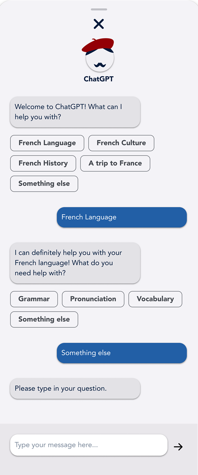
ChatGPT
While doing the competitive audit, I realized that I could use ChatGPT in the design itself since students wanted a place where they could ask questions.
I specifically asked if I could limit the scope of ChatGPT’s response options so that it only answers questions about France and French language and culture.
It gave me a lot of options to scope the responses but I decided to go with pre-made prompts to help the students engage easily with the chatbot since based on research many of them were uncomfortable with technology.


An image of the ChatGPT chatbot pop up that’s shaped like a Frenchman, and the chat box open with some pre-made prompts.
User Flow

Although many of these pathways are common, I created a detailed user flow to help guide my wireframing to ensure I didn't skip any step that students or members would take.
An image of the user flow that I put together.
Design
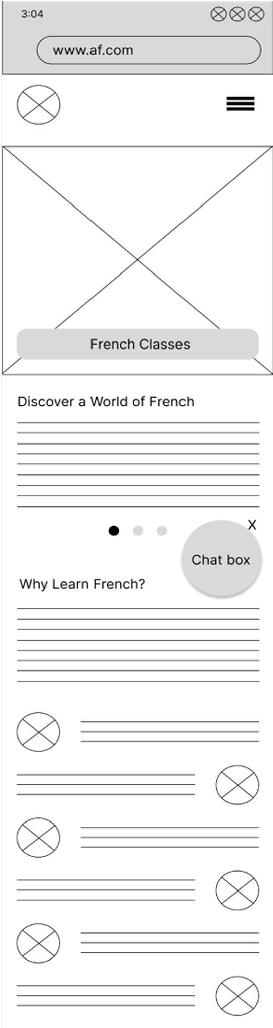
The research showed that most students would use the website on their phone so I went with a mobile-first design approach.
Wireframes
I quickly learned that the website would need to be much bigger than expected, and I created 20 pages of desktop wireframes and 25 of mobile wireframes.

High Fidelity
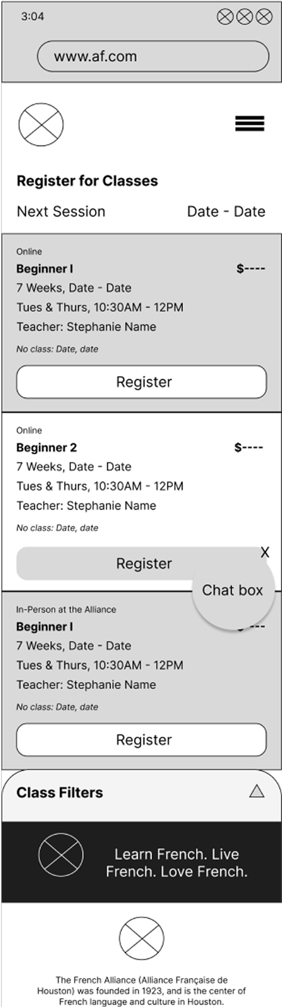
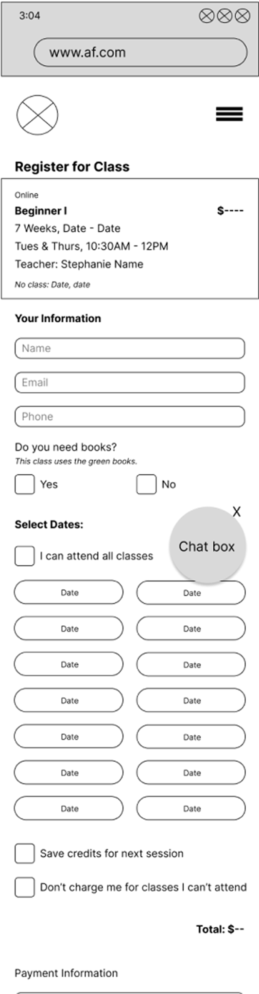
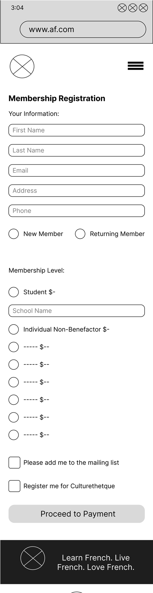
With this new website experience students will be able to:
Become a member online and enjoy the benefits such as discounted classes and special events. The events are viewable on an event calendar.
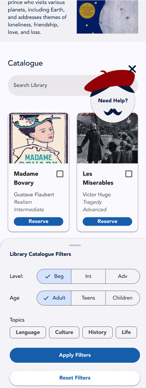
Take a placement test to find out their level, then search the digital library for books at that level using advanced filters.
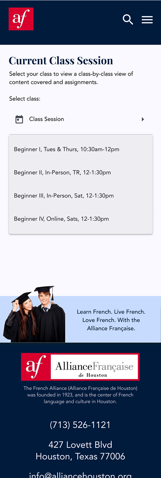
Sign up for French classes online, keep track of their class information and assignments, and ask the chatbot questions, all on their phone.

Testing
I conducted usability testing in-person with my fellow students and remotely via Maze with 15 other participants.
Tasks included:
Finding out French level using placement test
Signing up for classes
Reserving a book
Finding the class calendar for a missed assignment
Becoming a member
Signing up for an event
Engaging with the chatbot
In general, users easily signed up for classes, become members, and find local events.


Task Completion Rate (%)
Class Registration - 100%
Placement Test - 82%
Class Calendar - 0%
Become a member - 100%
Reserve a library book - 78%
Get an event ticket - 82%
Engage with chatbot - 75%
Drop-off Rate (%)
Class Registration - 0%
Placement Test - 18%
Class Calendar - 100%
Become a member - 0%
Reserve a library book - 22%
Get an event ticket - 18%
Engage with chatbot - 25%
User Comments
Students had generally positive things to say about the website. The biggest struggle was finding the class calendar, which showed the curriculum and assignments for each class session.
“I like it has a professional and academic atmosphere.”
“I could not figure out how to see what I missed in class.”
“It made sense, except I couldn’t find the previous class”
“It seemed clear except how to find missed classes.”

Iterations
The main iterations to the design that I would do are as follows:
Split the payment page up into 2 pages, users felt overwhelmed by the long checkout page
Make the class calendar a button on the classes page
Make the basket larger on the library page
After the placement test show the user the class that matches their level
Conclusion
I enjoyed this project because I got to dive deep into user’s needs and help a local organization that is providing a service to the community.
What I Learned
Remote unmoderated testing using Maze
Utilizing usability testing feedback to discover design improvements
Designing a chatbot feature and using ChatGPT to support my design process
The web version of the high-fidelity prototype