
Empowering ESG investors to buy Bitcoin via a Clean Bitcoin dashboard that visualizes their environmental impact
-

Company
Clean Incentive
-

My Role
Freelance UX Designer
-

Project Type
Mobile-Responsive Dashboard
-

Team
Me + CEO
-

Tools
Figma
-

Year
2023
Company Background
Empowering ESG investors to buy Bitcoin is no small feat.
Clean Incentive is a crypto-environmental startup that aims to attract ESG investors who are hesitant to purchase Bitcoin due to its environmental impact.
-

Problem
Many investors want to purchase Bitcoin, but due to personal or corporate restrictions based on environmental concerns, they do not pursue investing, since crypto mining is environmentally unfriendly.
-
Challenge
How might we provide investors who want to invest in Clean Bitcoin a way to purchase verified Clean Bitcoin so that more people purchase Bitcoin and miners are incentivized to produce more Bitcoin using clean energy?
Solution
A B2B/B2C dashboard where investors feel secure and miners feel incentivized.
I designed the Clean Bitcoin Dashboard which bridges the gap between ESG investors wanting to purchase Clean Bitcoin and miners who mine with renewable energy.

The final UI of the dashboard that shows the environmental impact.
Key Skills: Product Strategy, Competitive Audit, Wireframes & High Fidelity Design, Dashboard & Data Visualization, Advocating for UX Design
How it Works
Verified Clean Bitcoin rewards sustainable mining.
Clean Bitcoin partners with miners who produce sustainable BTC to be sold at a premium.
Clean Incentive provides a Certificate verifying clean status as an NFT.
ESG investors buy both on our dashboard, and the premium goes back to miners to incentivize them to continue producing sustainably.

Business Accomplishments of the Dashbaord
-

Remove institutional barriers for clients with ESG mandates
-

Create financial incentive for miners to use clean energy
-
Verifiable proof of carbon impact using trusted auditors
Who are we serving?
The CEO knew the target users but hadn't considered engaging them directly.
Since the CEO was new to UX design, I stressed the importance of user research to shape the dashboard.
While we knew our target users (ESG investors and sustainable miners) we needed to refine their profiles and identify where to reach them.

What is an ESG investor?
Our users are ethical buyers and won’t buy just anything.
An ESG investor is defined as an individual or entity that takes into consideration the following when making investment decisions:
-
Environment
Impact on the planet
-
Social
Impact on people
-
Governance
Governance policy

Potential Users
I brainstormed with the CEO the following potential users.
We wanted to make a B2B/B2C solution, so we needed to target both sides of the Bitcoin exchange - mining/selling and buying.
-
General Bitcoin
Corporations, Exchanges, Retail Investors, Environmentalists, Policymakers
-
Fund Managers
Endowments, Pension Funds, Sovereign Funds, Hedge Funds, Family Offices, ESG Review Boards
-
Mining Companies
Data centers using clean energy as well as those interested in clean energy mining
A Shift in Focus
We attempted to contact some of these users however were unsuccessful.
I advised the CEO to shift our focus to a competitive audit. I audited 6 dashboards and exchange platforms for features, accessibility, user flow, and navigation:
Hydrogen Map
Water Environment Federation
International Carbon Registry
OpenSea
Electricity Maps
Verra Carbon Credits


How to Stand Out
The competitive audit clarified a lot of ambiguity.
This audit showed the CEO how we could leverage insights from similar companies for user interface features and combine them with the company vision.
I discovered several major opportunities and gaps we could fill with our solution that competitors lacked.
-
Many of the dashboards were unusable on mobile
-
Some of the dashboards were hard to read and used color coding which could be a problem for accessibility
-
Some of the dashboards did not include a marketplace, while others did
-
The dashboard should show a clean energy breakdown and carbon impact and have educational content to show investors why certificates are important and how the dashboard works
-
Each miner needs a dedicated page where they can showcase their sustainability reports and efforts
-
Some of the tables did not have filters or search which are essential for large data sets
MVP Features
-
Color-coded map with icons showing data centers
-
Collapsible table with filters and search of available projects for purchase
-
Pie chart showing Energy Source Breakdown of the certificates available
-
Sustainability reports and individual pages for each of the miners
-
High-level Certificates Summary of carbon and energy impact
Our Users’ Goals
We had to make some assumptions about our users goals.
Although we didn’t have direct research with users, we could safely assume what tasks they wanted to do on the dashboard based on common ESG investor needs and competitive audit insights.
I collaborated with the CEO to map out a high-level user flow, then I created a granular user flow.
Tasks Our Users Need to Accomplish
-
View a specific project (Bitcoin + Certificate) to see environmental impact
-
View sustainability reports of the miners to learn about the their sustainability
-
Explore educational content and white paper to learn how the dashboard works
-
Purchase a specific project (Bitcoin + Certificate NFT) or a collection of projects

The high-level user flow for the tasks needed
Dashboard Design - Wireframes
Investing more time into wireframing helped us stay adaptable.
As stated before it was imperative that our design was mobile-friendly so I used a mobile-first design approach to create wireframes, exploring dashboard layouts.
I emphasized refining the design layout during this stage for maximum flexibility since business changes were always possible. Through four iteration sessions, I thought we were in a good place to move on.
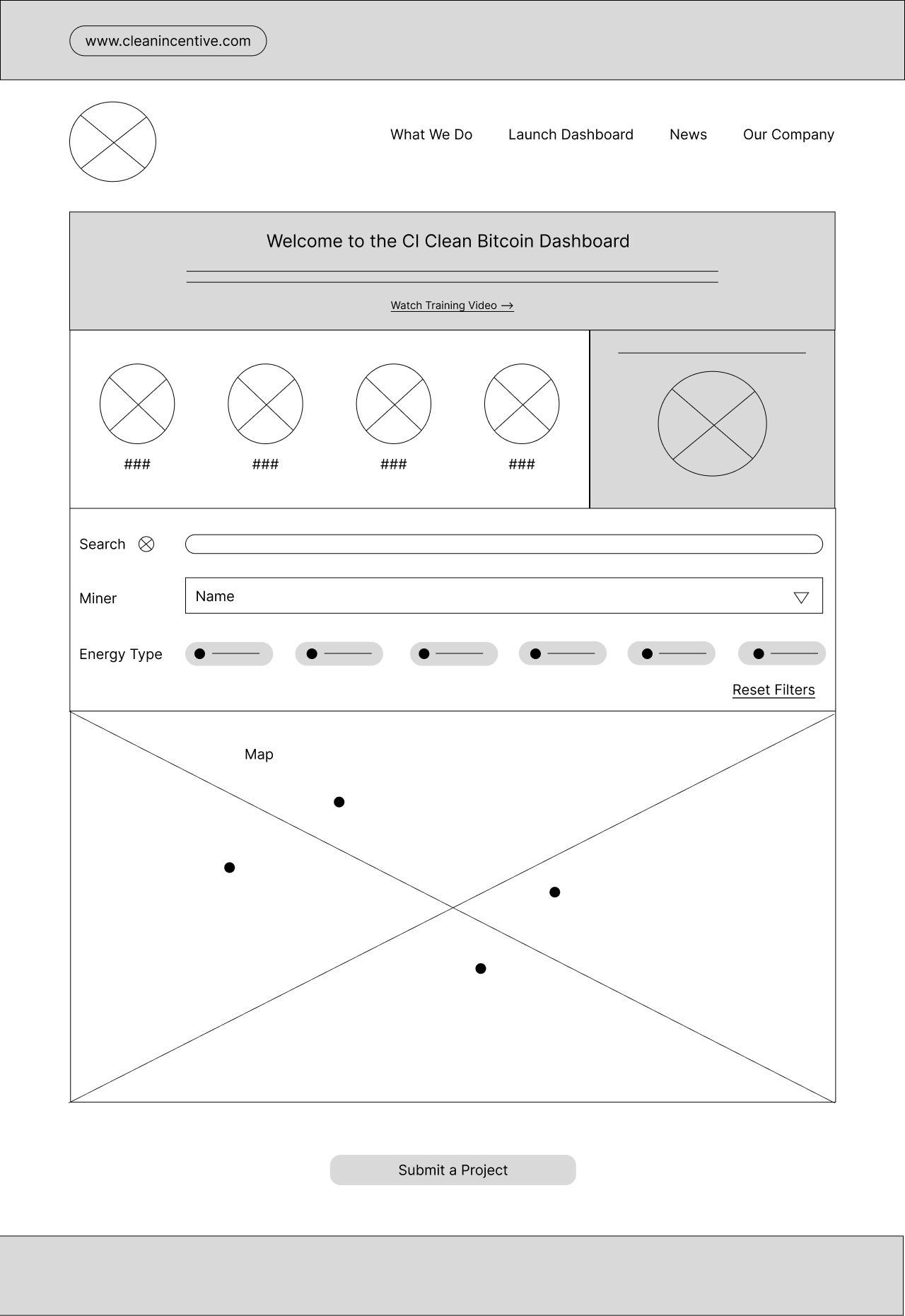
Web wireframe for the dashboard home
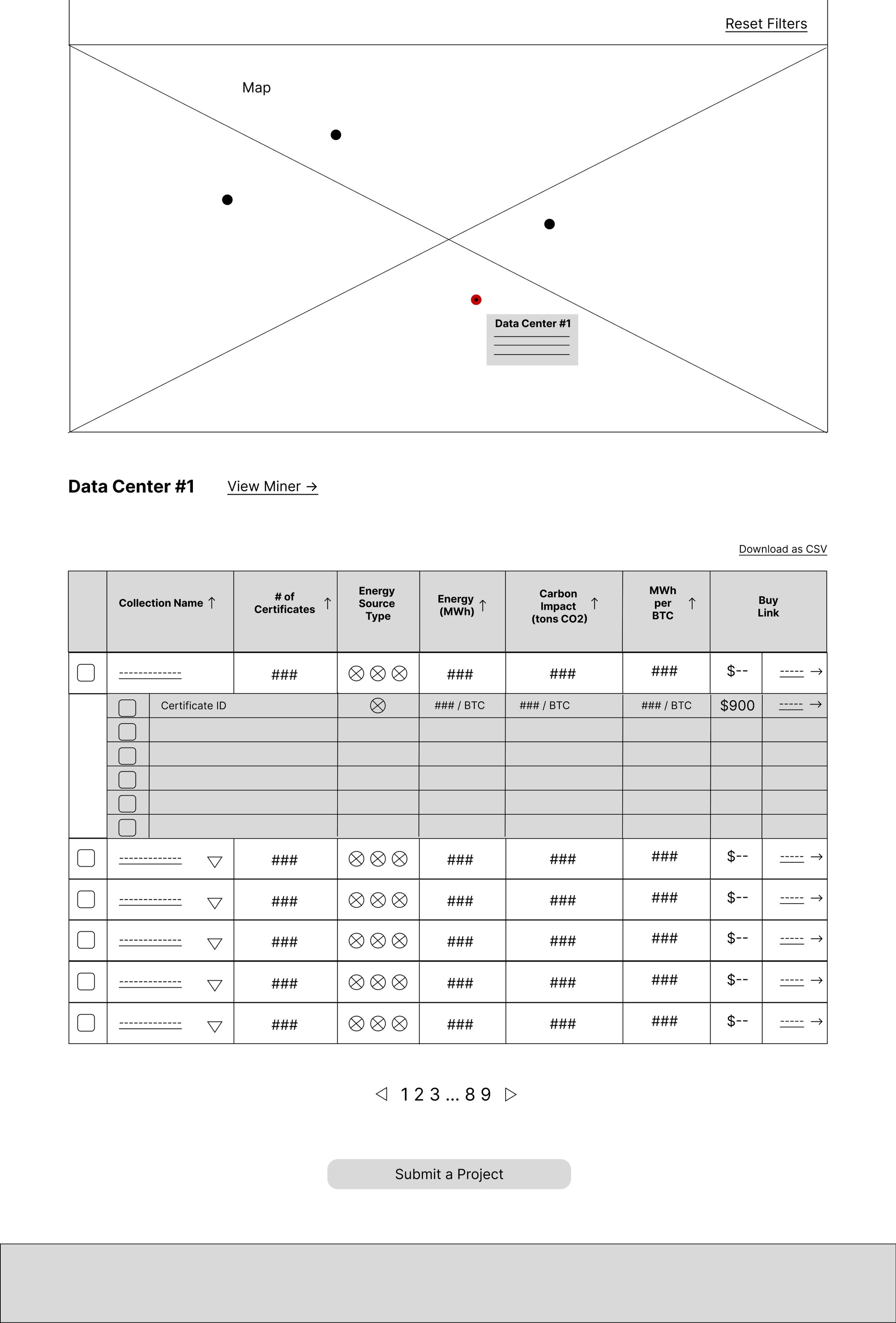
Web wireframe of the certificate table

Mobile wireframe of the dashboard home

Mobile wireframe of map and pie chart
Dashboard Design - High Fidelity
I made sure our final look was beautiful, intuitive, and accessible.
I designed the high-fidelity interface using brand elements, balancing a dark, high-tech aesthetic with green for sustainability.
From the competitive audit, I addressed key accessibility issues by adding icons alongside color coding on the map and implementing search and filter functions for the table.
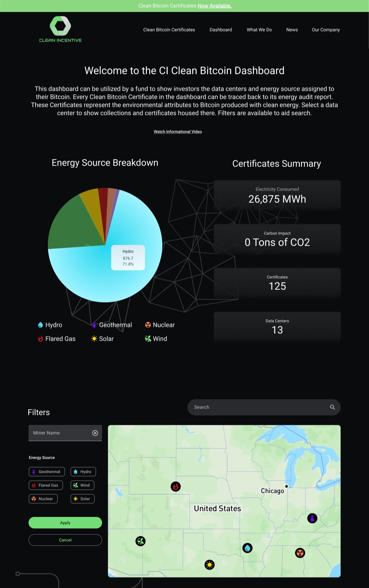
High-fidelity web version of the dashboard home

High-fidelity web version of a certificate for purchase

High-fidelity web version of a miner's page

High-fidelity mobile version of the dashboard map

High-fidelity mobile version of the dashboard pie chart

High-fidelity mobile version of the certificates table
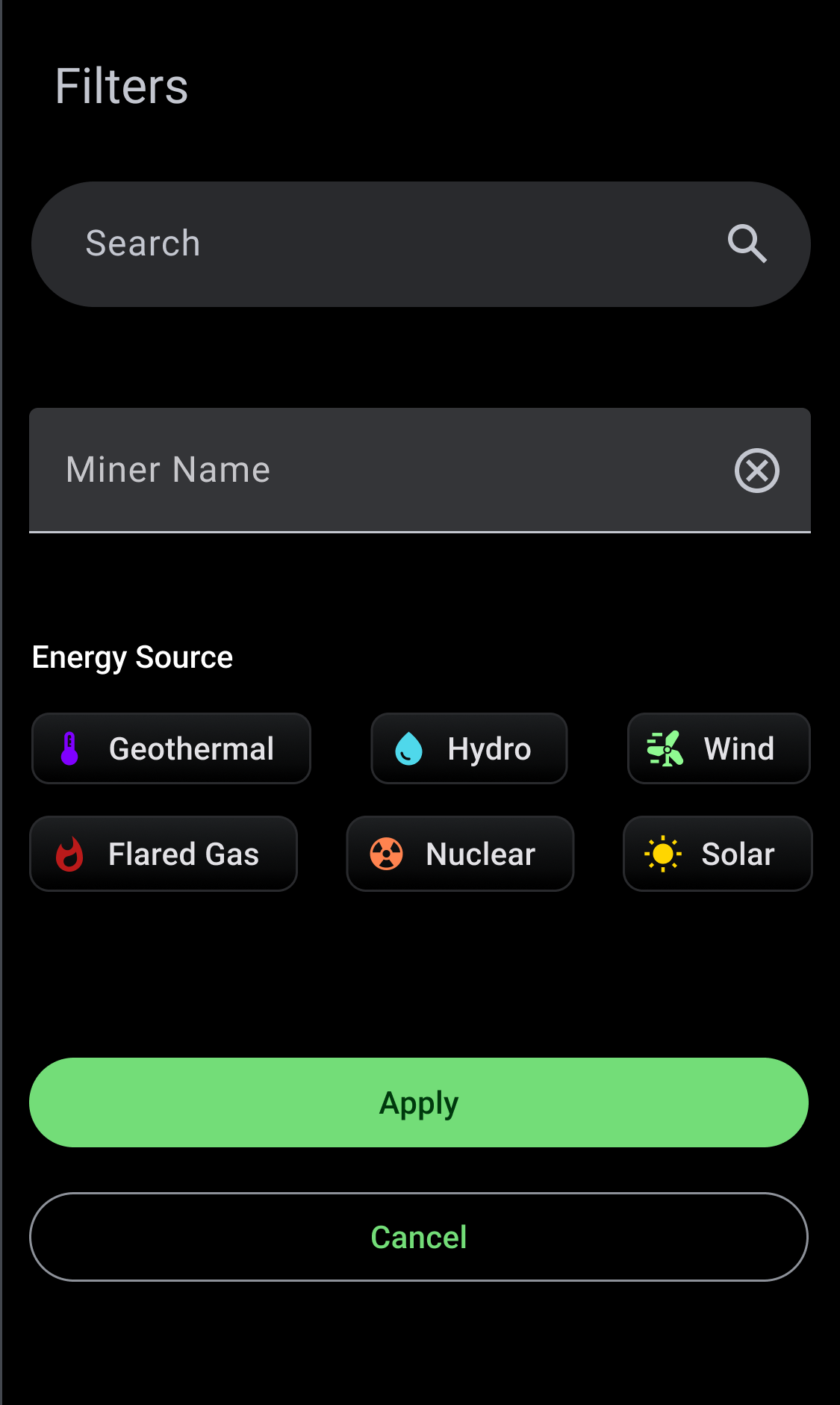
High-fidelity mobile version of the table search and filters
Conclusion
After the project, the CEO became a believer in UX.
By working directly with the CEO, I not only created an elegant design solution, but I also helped him recognize UX as a crucial part of product development.
I took the CEO from someone who didn’t know anything about UX to someone who understands its value. Awareness about the benefits of UX encourages people to invest in it.
Key Outcomes
-
High-fidelity prototype of web and mobile versions that will be used to present to investors
-
Branded, intuitive design that accomplishes business goals and follows industry standards
-
A much deeper understanding of the crypto industry and how it is becoming more sustainable
Want to learn more?
Email me so we can chat about how I can help you! I’m actively looking for Product Design opportunities and ready to interview!
View My Next Project
Creating a digital experience for students and members to enhance their French language and culture journey at L’Alliance Française Houston.