
Structuring and crafting an enterprise-wide, responsive design system for scalability and consistency across devices and products
-

Company
LivaNova
-

My Role
In-House UX Designer
-

Project Type
Design System
-

Team
5 Designers, 2 Developers
-

Tools
Figma, Dovetail, Frontitude
-

Year
2024
Key Accomplishments
-

Created 25+ responsive components in Figma using auto-layout to be used across device types
-

Eliminated almost 100% of screen layout issues that occurred due to large font and long languages
-

Created a design system structure that streamlined designer usability and developer handoff
Watch my video case study (12 mins on 1.5x speed) or keep scrolling to read (8 min read).

Company Background
Implantables for the head and the heart
LivaNova is a medical device company that makes life-changing implantables that use vagus nerve stimulation to improve the quality of life of patients with chronic conditions like epilepsy and other conditions that affect the brain and heart.
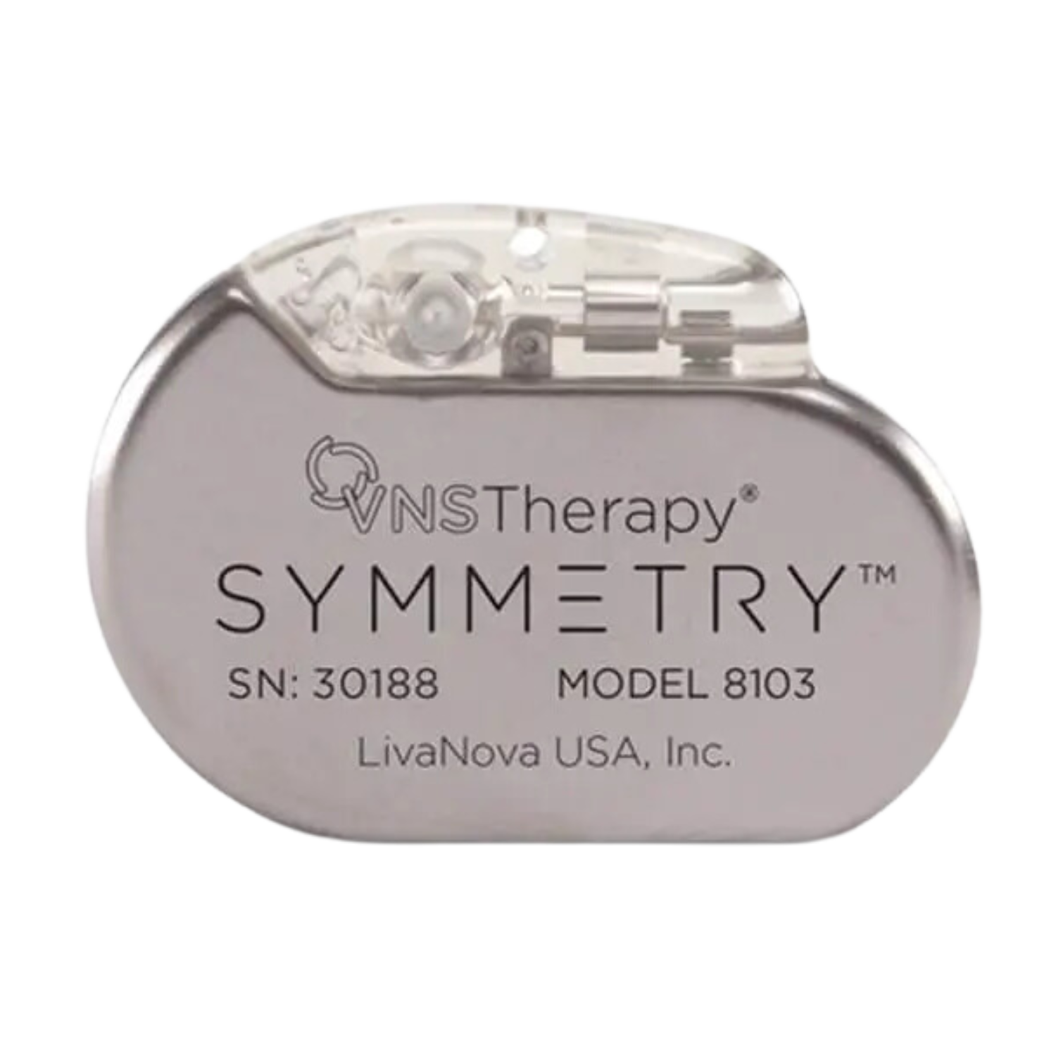
A LivaNova VNS Therapy implantable device.
DISCLAIMER: Due to the proprietary nature of the products LivaNova builds, I have replicated what I accomplished and worked on with placeholder information and imagery.
Project Overview
In health tech, users require flexibility, speed, and accuracy.
It was my team’s job to modernize our products’ usability by creating digital alternatives for the current hardware for neuromodulation treatments which would allow for more flexibility for VNS therapy clinicians and patients.
My Value Add
I helped lay the foundation for scalability and consistency for digital products.
In my role as a UX Designer, I helped structure an enterprise-wide design system, created 25+ responsive components for the UI kit and helped make handoff documentation.
I was on a distributed team with 4 other designers, 2 developers, our UX manager, and cross-functional teams such as clinical.
Key Skills: Figma Auto-Layout, Variables, File Organization & Prototyping, Responsive Design, Developer Handoff

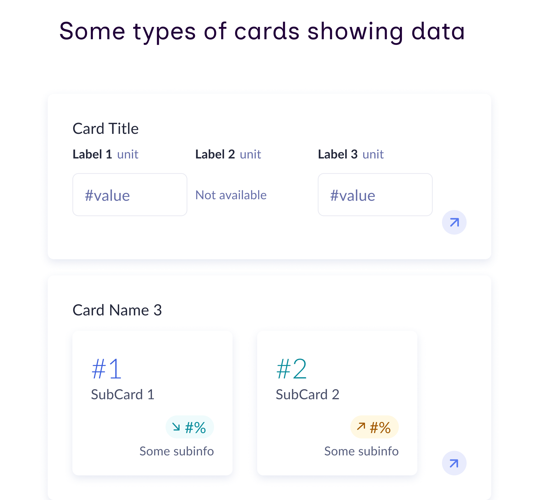
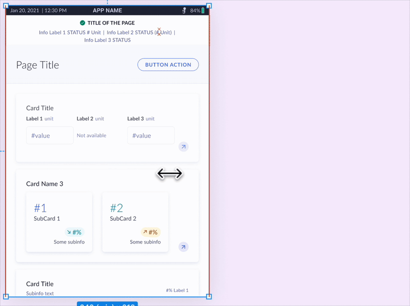
An example of a completed UI using our new components.
A Leader in the Industry
Our hardware sets the standard in medical implantables and our digital solutions had to match that excellence.
To accomplish this, we needed an enterprise-wide design system that:
laid the foundation for scalability and consistency
streamlined developer handoff
was easy for designers to maintain
successfully addressed the 3 business and user needs explained below


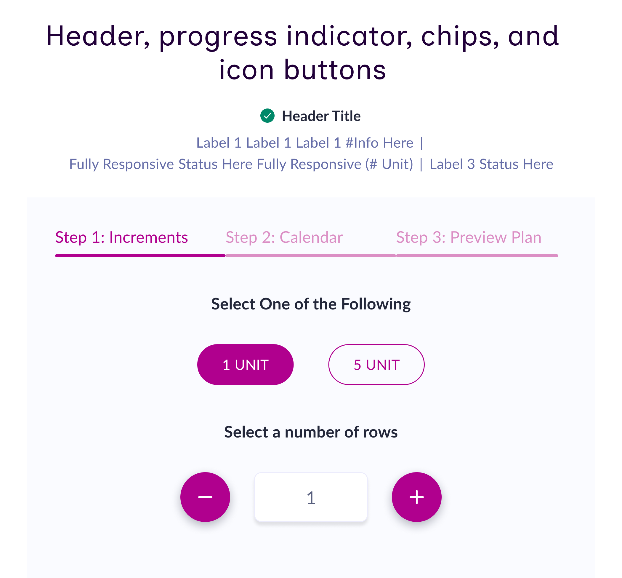
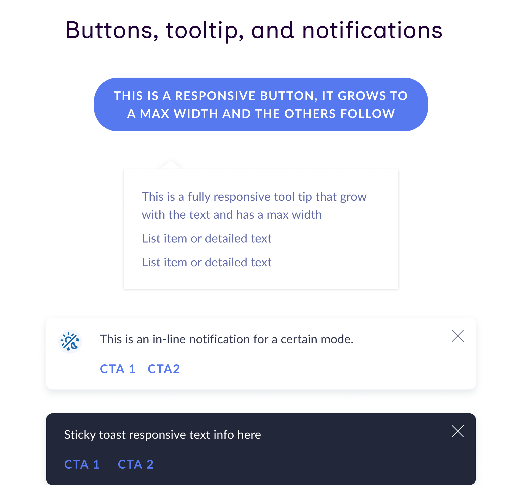
Responsive button components I made with icons that can be hidden.
Business + User Needs
-

Legibility
Accommodate different font sizes (user need)
-

Localization
Accommodate different languages (user/business need)
-

Responsiveness
Accommodate different screen sizes (business need)
Here’s how we did it!
Research: Current Design System Structure
Unfortunately, we started with a big, disjointed mess.
A quick investigation into the current state of our design system showed us it wasn’t much of a system at all but more like 3 estranged siblings doing their own thing and behaving by their own rules.

A diagram that visualizes the current state of the disjounted design systems.
Problems we faced because of this
-
1
Products lacked consistent visual design
-
2
Components were built separately and not responsively
-
3
System prevented scalability for future products
Research: Empathizing with our Developers
Ever built a complicated piece of IKEA furniture from just the picture rather than the instruction manual?
That’s what our developers had been expected to do.
For the first version of the tablet app, developers were handed Figma screenshots and told to recreate them exactly, with minimal instruction to dictate behavior, scrolling and responsiveness.
Previous implementation of our tablet app led to incorrect and erratic design behavior.

An example of how parts of the tablet app behaved when translated to a longer language.
But what can we do about it?
I facilitated key discovery conversations with our developers.
I advocated for earlier and ongoing developer involvement because it seemed like our developers weren’t in the loop with the designers.
We uncovered 3 specific pain points and blockers they faced, detailed below.

Some parameters that we learned the developers wanted to know.
Developer Pain Points
-

Figma
They were quite unfamiliar with Figma and didn’t want to have to search in its features.
-

Interactions
They struggled to understand annotations for interactive behavior and scrolling.
-

Responsiveness
They wanted specific parameters to help dictate responsive behavior.
Ideation: Design System Structure
Planning the structure was the key first step that was missing before.
I researched common design system structures and presented them to my design team.
Then I collaborated with them to shape a new design system structure that would be easier to maintain, smooth development handoffs, increase usability and consistency, and scale easily for a growing business.

The new structure of the design system.
Ideation: UI Kit Components
Our structure was technically new but there was no need to start everything from scratch.
Now that we knew the structure and where we wanted our foundational UI kit to live within it, we audited the 3 design systems (20-40 components each) and identified shared components to populate it.

How we identified overlapping components from each device.
Design: Components
I created 25+ pixel-perfect, responsive components.
I followed this process when creating my new components, which included ones for the UI kit and product-specific ones. I used the new UI kit components to make the product-specific variants.
-
Analyze each component to see:
how they were implemented in Figma
what were the use cases and context
-
This allowed me to consolidate each component into a default base version & necessary variants.
Product-specific variants would be built on top of this base version.
During this stage I also defined the parameters of the component that would be necessary for the developers such as min/max width for text wrapping.
-
Remade the components by:
Researching other design systems
Presenting ideas to other designers to get alignment
Creating the component with auto-layout in Figma
Implementing the parameters as variables
Creating the variants as needed
-
We tested the components for the following:
Color accessibility
Larger font size
Longer languages
Different screen sizes
-
I redid 5 sets of screens for different user flows with the new components and responsive layouts for our tablet app screens.
-
Handing off newly made components to the developers. More information detailed below in “Handoff” section.


One of the more complicated chart components I made that use auto-layout and scale.
A header component with responsive buttons whose text wraps when they reach a max width
Testing: Large Font Size
Testing for font size increases was a laborious manual task.
Our users love larger fonts, and our designers LOVED manually increasing each text box’s font size TWICE to test that a larger font wouldn’t break everything!
I hope you didn’t believe that last part.
“I wish we could change all of these text boxes at once.”
I implemented an easy fix to make that a reality.
When she said that to me, I laughed and agreed with her. Then it hit me that we can!
I introduced font size variable modes in Figma, letting designers test screens with one click. This saved us several minutes per screen.

A gif of the font variable modes increasing size automatically
Testing: Longer Languages
“Medizinisches Gerät” is “medical device” in German, and this word and many others are significantly longer than their English equivalents.
Since our products are used by clinicians and patients all over the world, we had to support multiple languages.
The ones with extra-long text strings would frequently break layouts, and it was hard to tell which language would break which piece of the layout.
To test for this, we collaborated with our clinical team to create a pseudo-language that combined the longest strings from various languages, letting us simulate worst-case scenarios.

A visualization of how the pseudo-language combines multiple languages into one screen to test worst case.
Testing: Screen Layouts
I introduced responsive design and auto-layout and eliminated nearly 100% of screen-level layout issues.
Since the screens were not originally responsively designed in Figma, any sort of change (font, language, or otherwise) would break the layout.
By updating the layouts of the screens with auto-layout, I successfully prevented the majority of breakages.
This, the pseudolanguage, and font size variables made testing each screen a breeze!

A before and after of a screen after implementing a responsive layout.
Testing: Iterating
Even after rework some layouts still broke so we collaborated to iterate on these designs.
We didn’t have many components that required major layout changes, but the ones that we did have were quite challenging to make beautiful while also accommodating the fonts and languages, and making sure the most important information was still clear.

An image of the before and after of a tough card component.
Handoff: Documentation Creation
We created easy-to-reference handoff documentation so developers wouldn’t need to dig through Figma.
We initially encouraged developers to use Figma’s Dev Mode to easily access component parameters but they preferred a more direct approach.
Our handoff documentation detailed responsive behavior, spacing, text wrapping, size constraints, interactions, dark mode, and component updates.
We had indicator dots that would show which sections were ready for the developers to view.

The handoff documentation showing responsive behavior, spacing, text wrapping, size constraints, interactions, dark mode, and component updates.
Handoff: Scrolling & Interactions
I created prototypes and added them as gifs to the handoff documentation to show scrolling.
As mentioned before the developers struggled to understand the scrolling behavior of screens.
With the gifs they could easily visualize the scrolling and interactive behavior.
They loved this!
“This is exactly what we need!”

A gif of two screen prototypes scrolling.
Results: Final Deliverables
We finalized the UI kit and remade all of our screens with the new components and responsive layouts.
I remade 5 sets of screens for different user flows and was able to make fully responsive pages like this one.
With everything we worked on in place, the old flows were super fast and easy to remake, so now creating any new flows will also be easy!
“The components that were built have saved me time and lots of effort by allowing me to spin up fast designs and allowing me to spend more time thinking about bigger issues.”
Recap: Accomplishments
The design system that we have now successfully accomplishes several business and user needs, and allows for LivaNova to seamlessly add new products as they continue growing!
I have enabled the design team to be able to design without layout issues caused by longer languages, large font size, and screen size changes by creating 25+ responsive components and new screen layouts in Figma using auto-layout and streamlining the developer handoff process.
Thank you to my team at LivaNova!
-
What I learned
- designing for small tablet screens
- understanding specs for developers
- designing for how to connect hardware to software -
What I would do differently
- use a plugin for handoff documentation
- connect more with the clinical team to deeper understand the medical side of the product
- try to learn Storybook more extensively
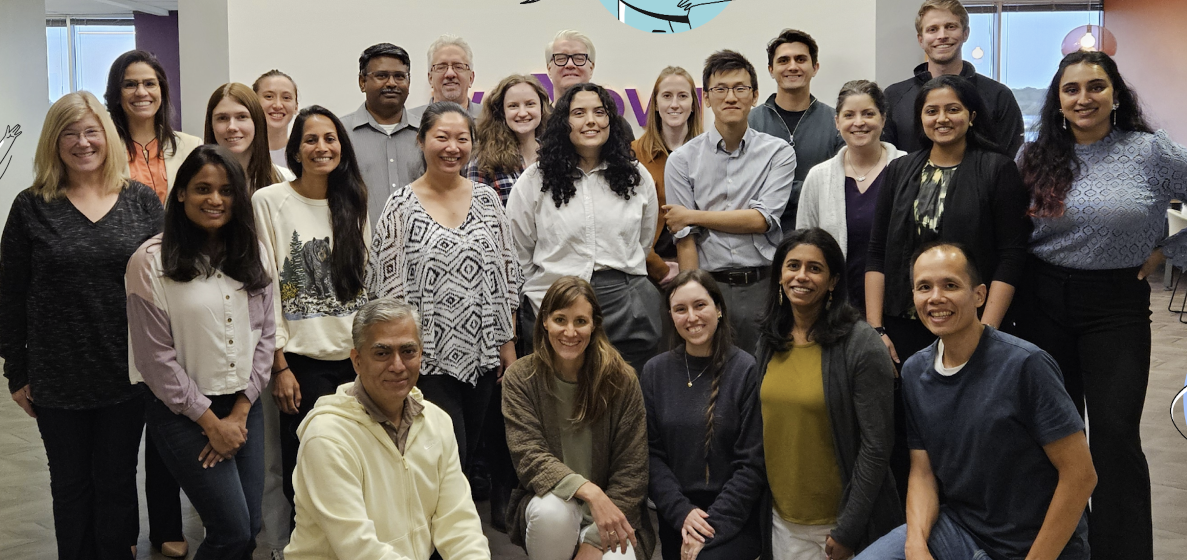
My team at LivaNova at an in-person collaboration workshop in the Houston, TX office.
Other Accomplishments
-
Illustrations
Componentized 50+ illustrations to make them easier to use and created illustrations as needed
-
Usability Testing
Conducted usability testing with different personas and used Dovetail to synthesize the findings.
-
Sharepoint
Created and organized a Sharepoint site for our team that allowed for easy onboarding of new employees
Want to learn more?
Email me so we can chat about how I can help you! I’m actively looking for Product Design opportunities and ready to interview!
View My Next Project
Connecting trail users to trail orgs for a transparent way to contribute to their trail maintenance and projects at Trailfunds